Infographics in Science Reporting: Why You Should Use Them, and How To Do It Well
Text and graphics by Andjela Djuraskovic
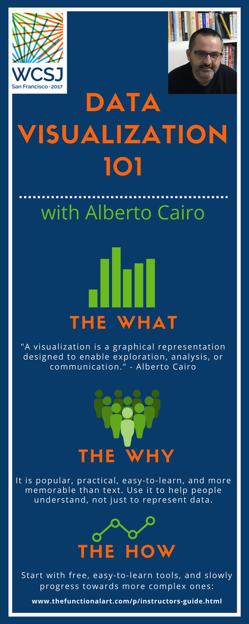
SAN FRANCISCO—Free software, data and some patience. According to Alberto Cairo, that is all you need to create your first visual representation of information.
With research showing that images are more memorable than text-based information, data visualization allows writers to turn pages of complex statistical findings into attention-grabbing images. And as Cairo, Knight Chair in Visual Journalism at the University of Miami, pointed out at the World Conference of Science Journalists 2017, it is not nearly as difficult as it seems.
“Visualization is becoming mainstream,“ stated Cairo at his 27 October session, “The Art of Truth: Data Visualization and Infographics for Everyone.” The renowned author and journalist supported his claim by citing The Washington Post‘s Carol D. Leonnig. Leonnig won a Pulitzer Prize in 2015 for her investigative pieces dealing with U.S. Secret Service, which contained both text and interactive graphics.
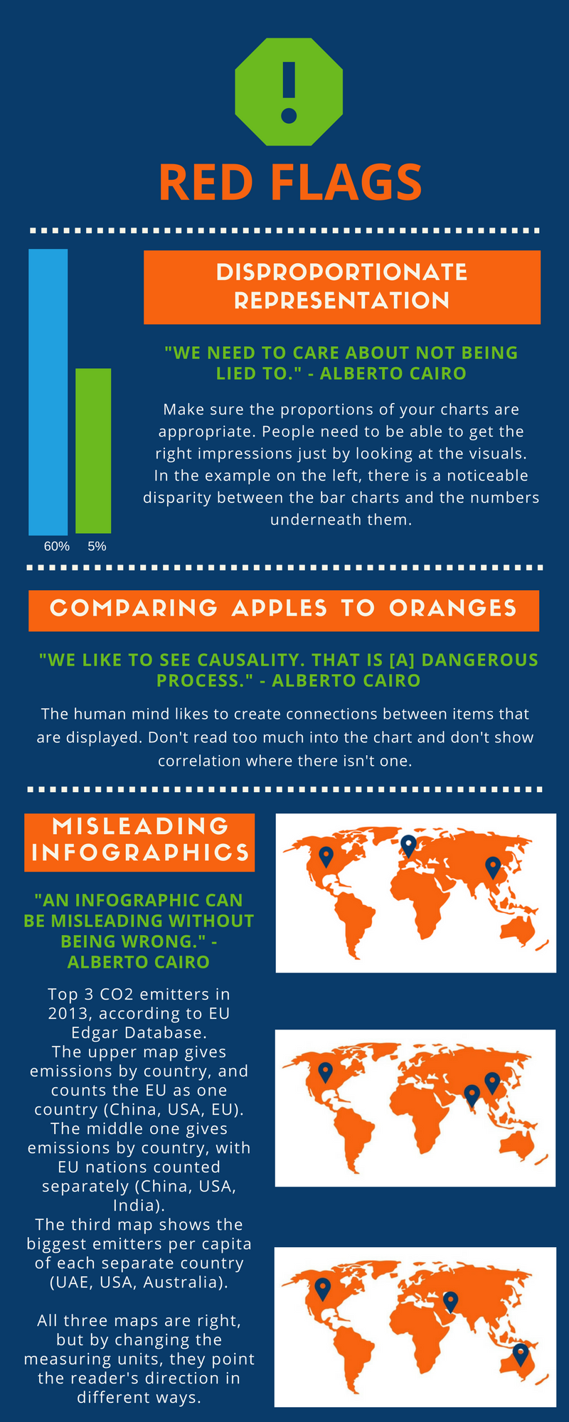
However, their rising popularity also boosts the chance that a reporter might use infographics in misleading ways. By knowing which forms are more detail-oriented than others, it is possible to create an unrepresentative chart without it necessarily being an untruthful one.
For example, a map may be a good choice to provide readers with a spatial representation of an issue’s scale. However, it is not among the most precise ways to illustrate how values compare between locations. Using maps to depict data that requires precision could result in a lot of information being missed out—information needed to fully understand the issue.
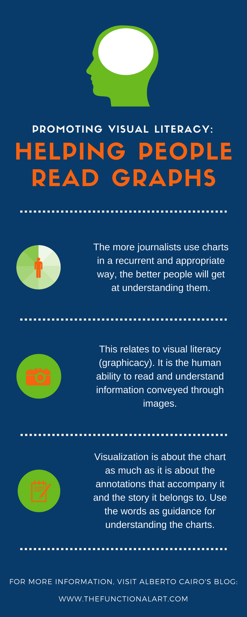
“A chart hides as much as it shows,” warned Cairo. He armed the attendees with an array of advice and resources that would enable them to create high-quality data visualizations—and to recognize the bad ones. He even tweeted the link to all of the materials he used in his presentation.
Cairo encouraged all attendees to tap into the world of creating graphic elements. To show that it is actually doable (and fun!), this story on his lecture is told through a set of infographics.
—
Andjela Djuraskovic is an environmental journalist and activist from Montenegro. She is currently pursuing a master’s degree in ecological politics, and writing for the online magazine Plezir.